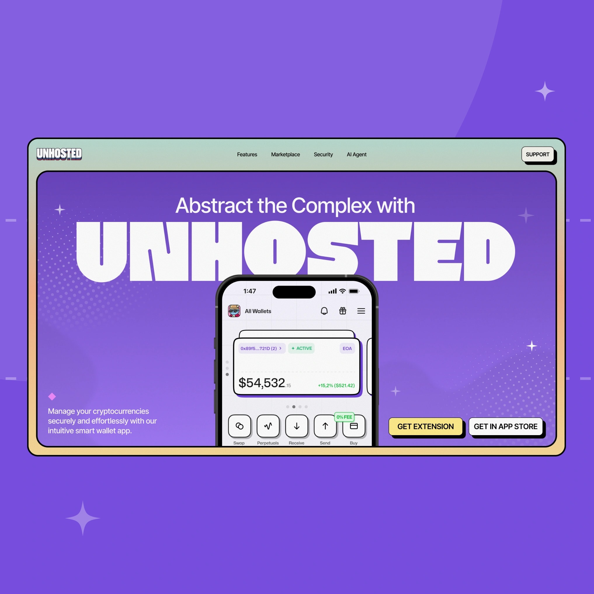
Designed the self-custody wallet behind 100,000+ generated accounts.
onboarding we designed
Self-custody is the right answer to a real problem — and the worst onboarding experience in consumer software.
Seed phrases, gas fees, bridges, approvals. Every one of them exists for a reason, and every one of them is a place where a normal person quits and goes back to an exchange.
Unhosted's bet was that none of it has to be visible. Account abstraction made that technically possible — smart accounts, gas paid in any token, sign-in with Apple or Google instead of a phrase on paper.
Our job was to make the product feel like the promise.
- Client:Unhosted
- Services:Product Design · iOS & Android App · Website Design
- Timeline:2025 – 2026
- Category:Crypto, Trading
- Integrated with:


“Data driven agency is what you need.
Perfect for launching new products, big W!“


for a beginner and complete for a pro
Self-custody's honest problem. Seed phrases, gas fees, bridges, approvals — every one exists for a reason, and every one is a place where a normal person quits and goes back to an exchange. Account abstraction removed the technical barrier. The interface still had to remove the fear.
Two users, one app. Someone buying their first $50 of ETH and someone running 50× leverage on Hyperliquid open the same screen. Neither could feel like the product was built for the other.
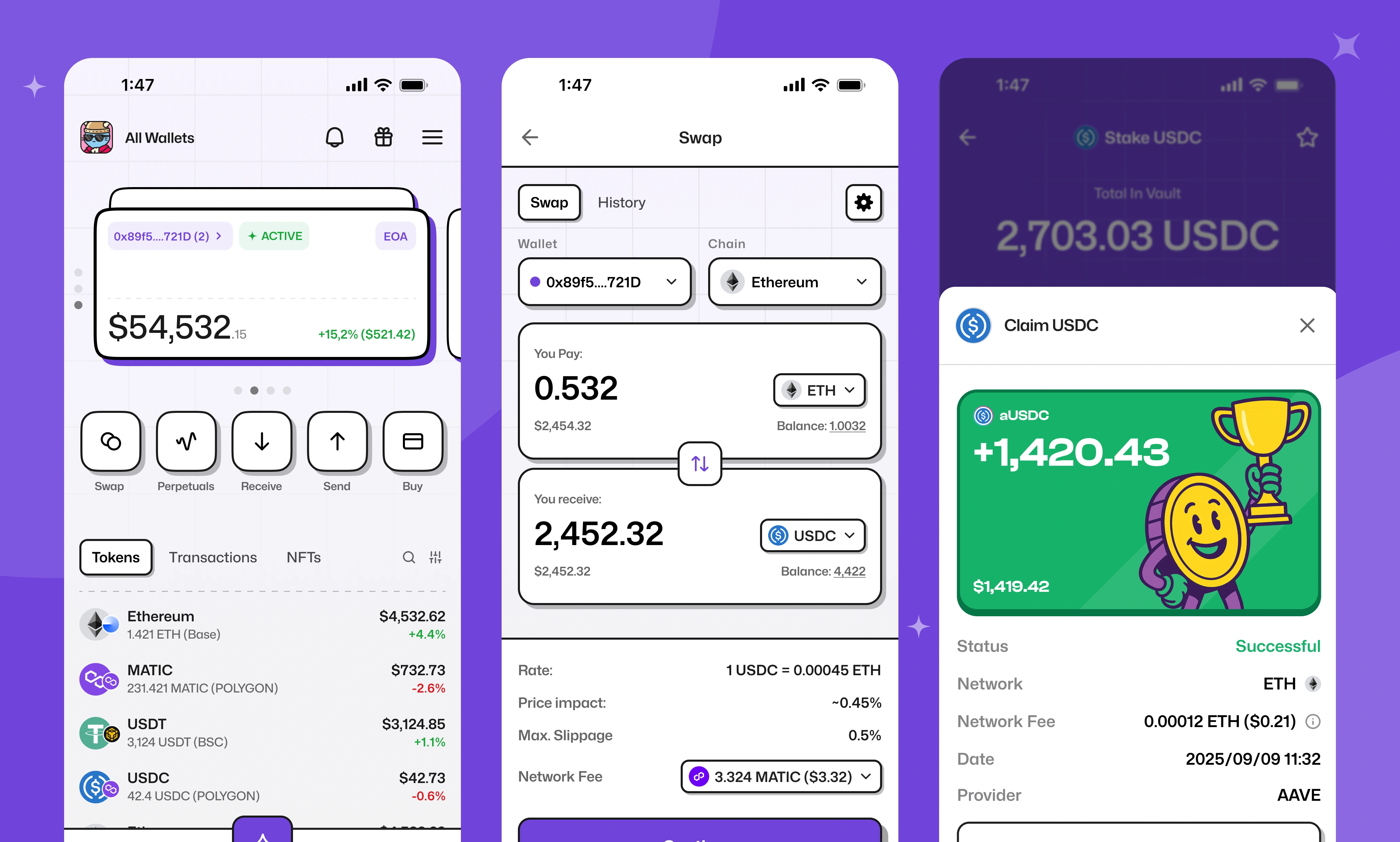
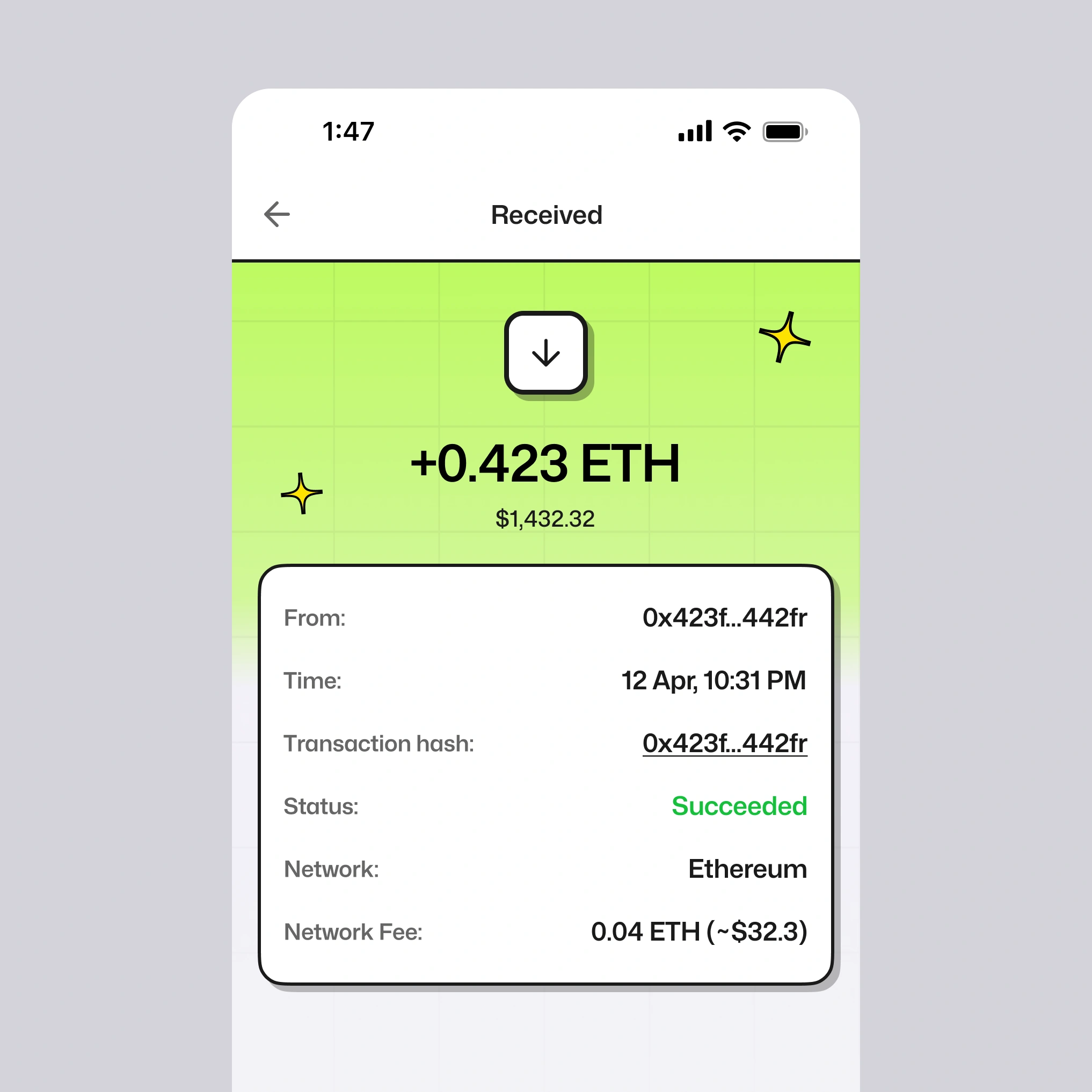
100+ chains in one feed. Ten million assets across a hundred networks, on a phone. Every balance, every transaction, every swap — legible without a chain selector in the way.
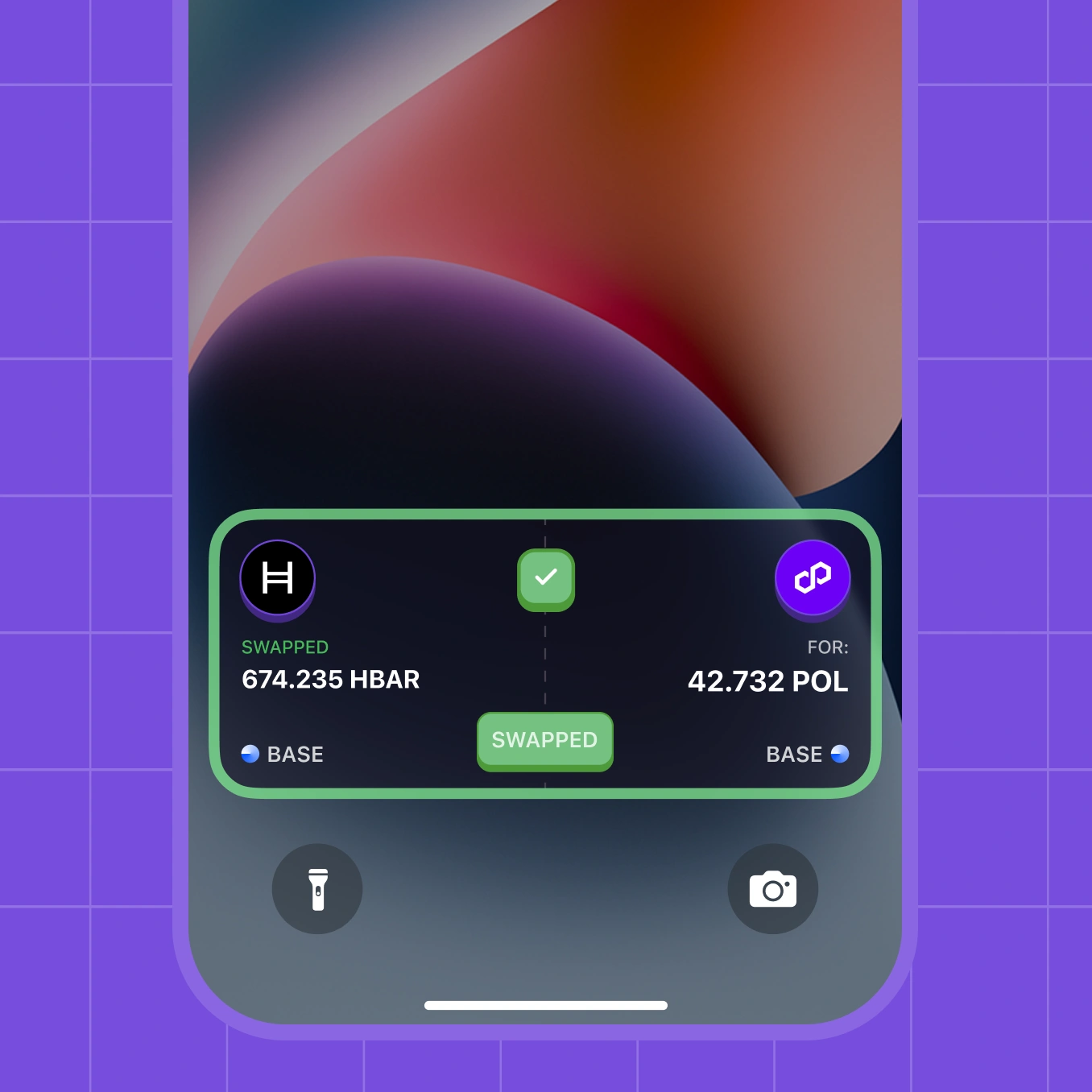
Real money, no undo. Swaps, approvals, and leveraged positions can't be rolled back. Each one had to say exactly what was about to happen and what it would cost, before the user committed.
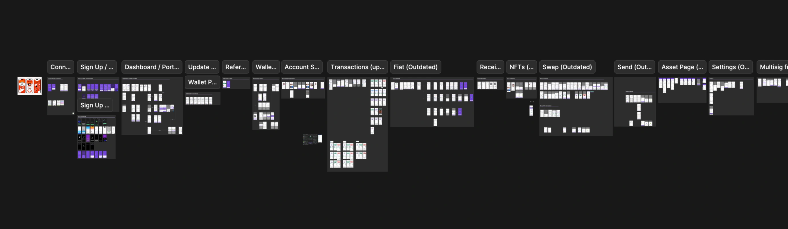
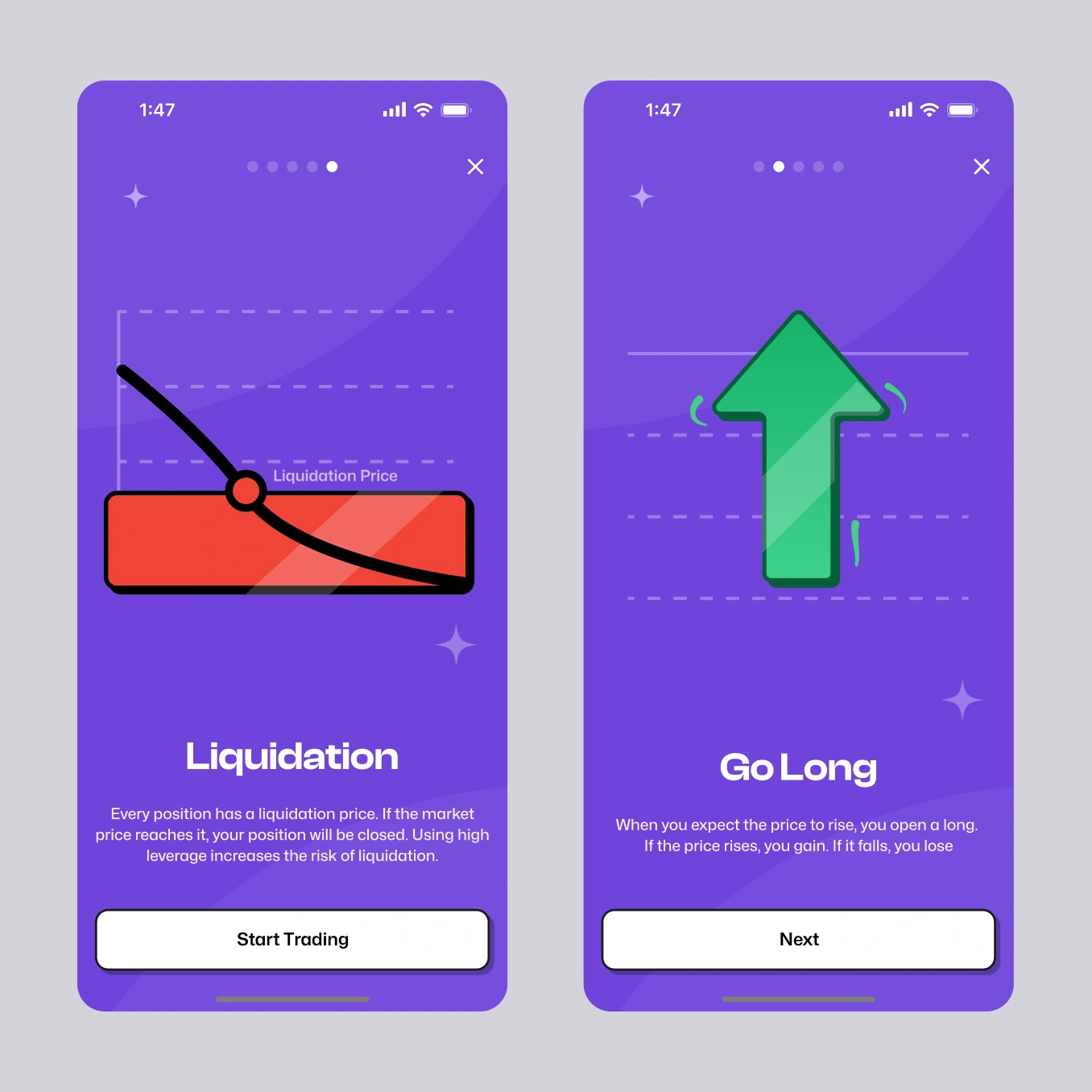
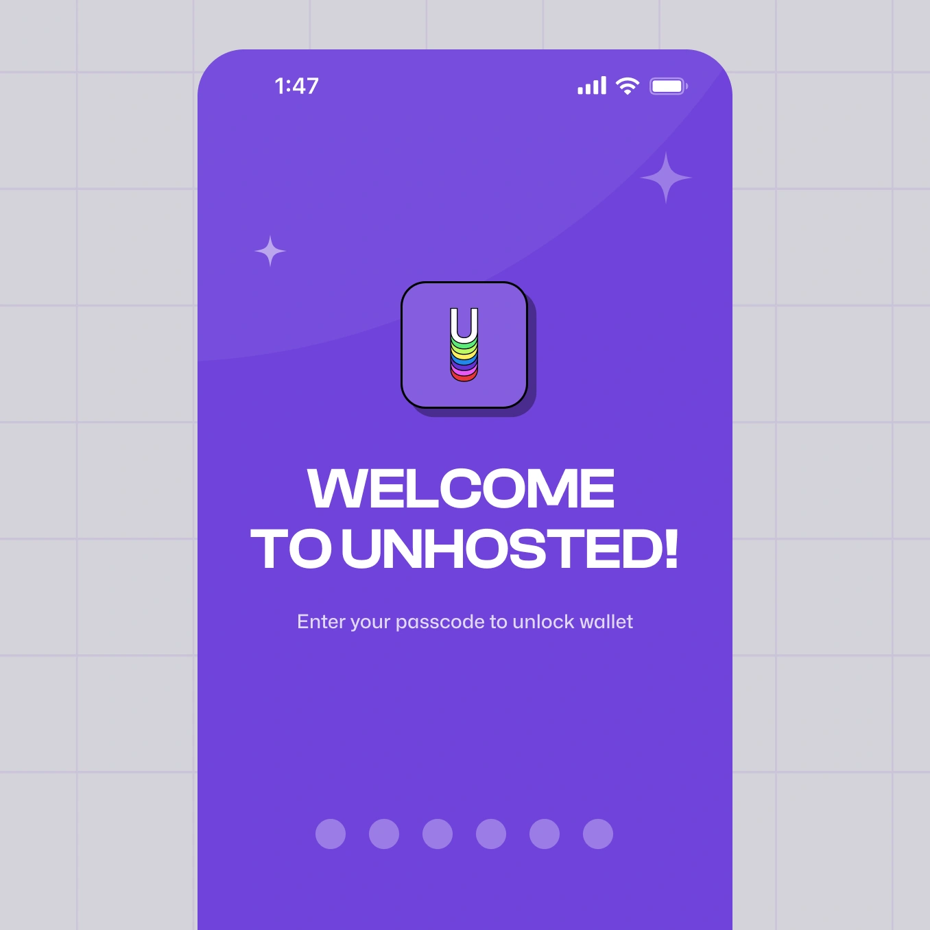
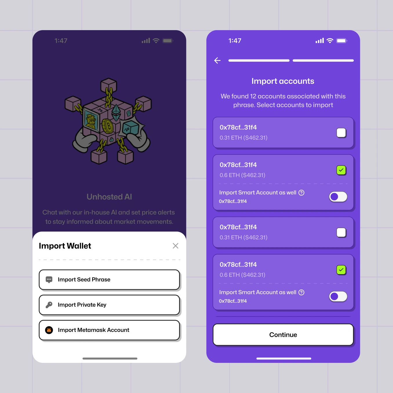
Everything here happens before a user has anything to lose. Drop off, and they go back to the exchange they already trust.
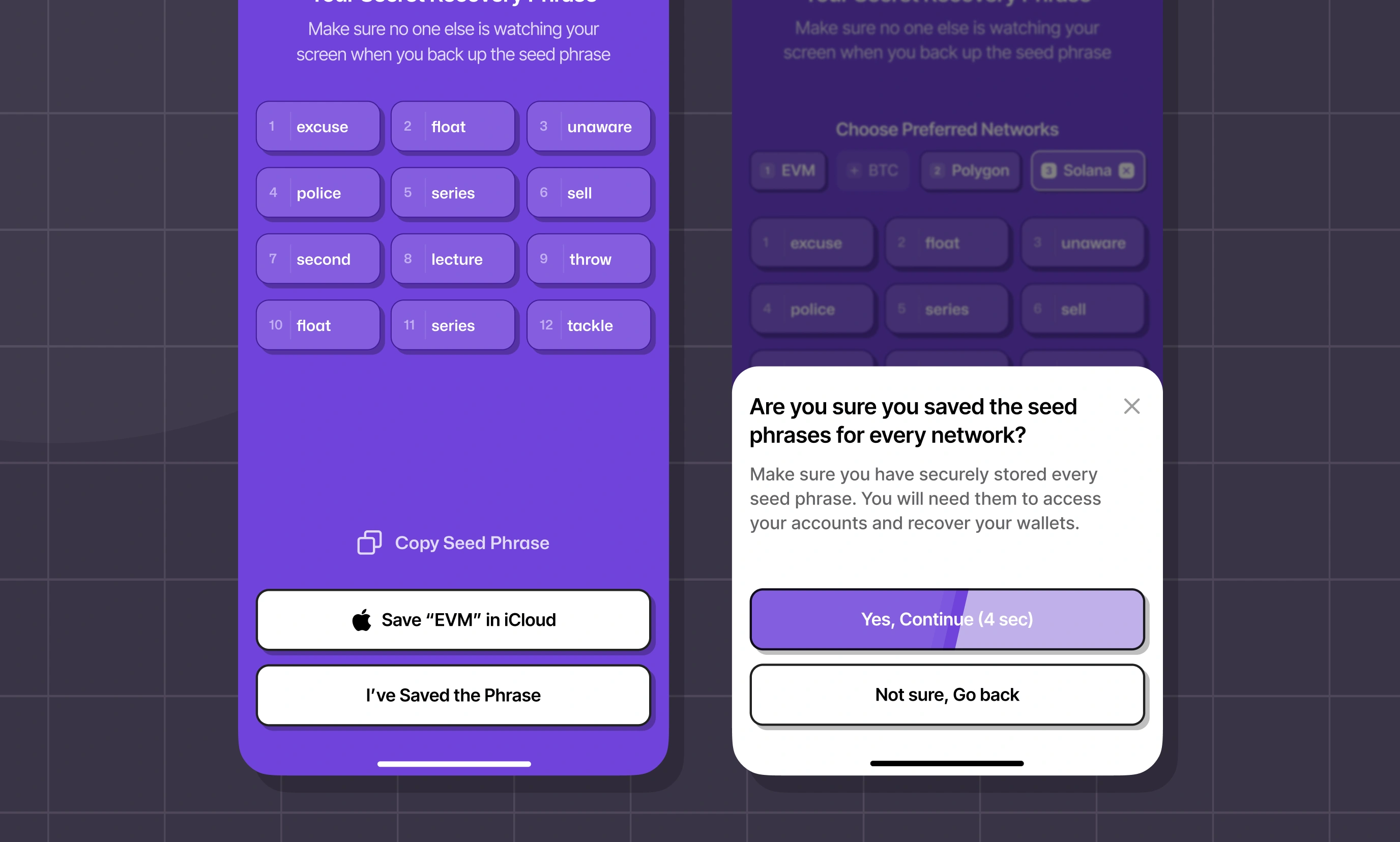
The hard part was network choice. A wallet spanning Solana, Polygon, and every EVM chain has to ask which ones matter to you — a question that means nothing to someone holding their first tokens.
We made it a preference, not a decision: sensible defaults, networks shown visually instead of as a list of names to decode, everything changeable later. Nobody gets blocked by a choice they aren't equipped to make yet.
is easy to demo and hard to design.
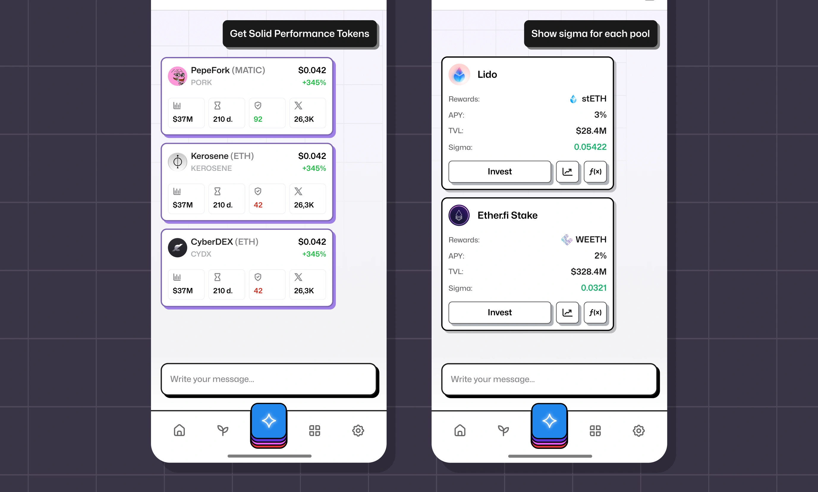
The AI agent analyses tokens, scans wallets, and surfaces trends — but it lives inside an app where every action touches real money.
That changes the design problem entirely: a chat interface that suggests trades has to be obviously advisory, never ambiguous about what it's doing on the user's behalf.
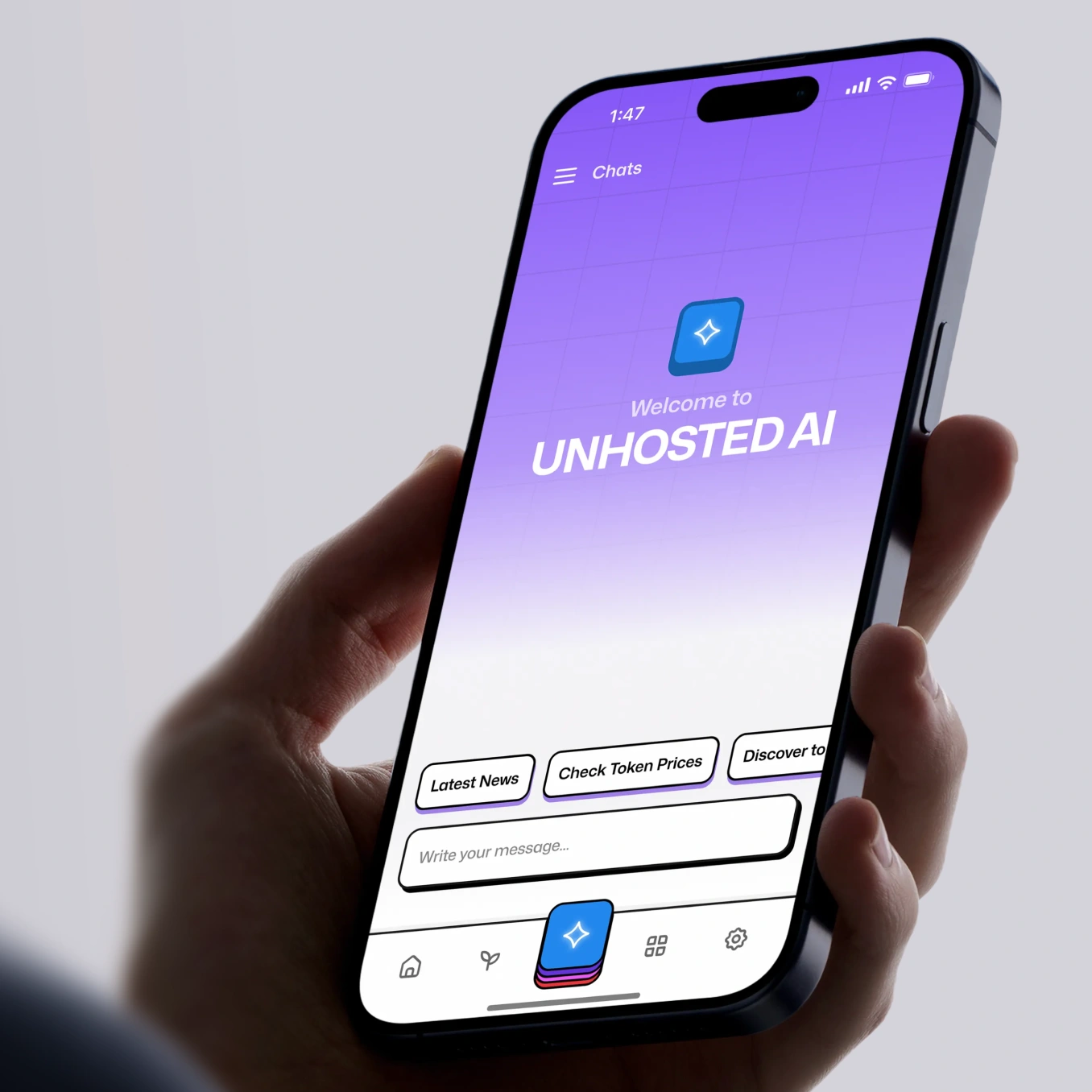
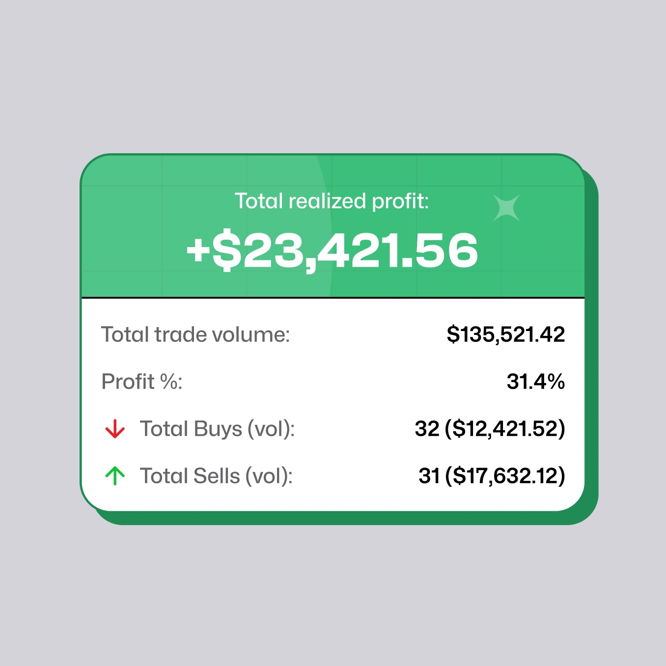
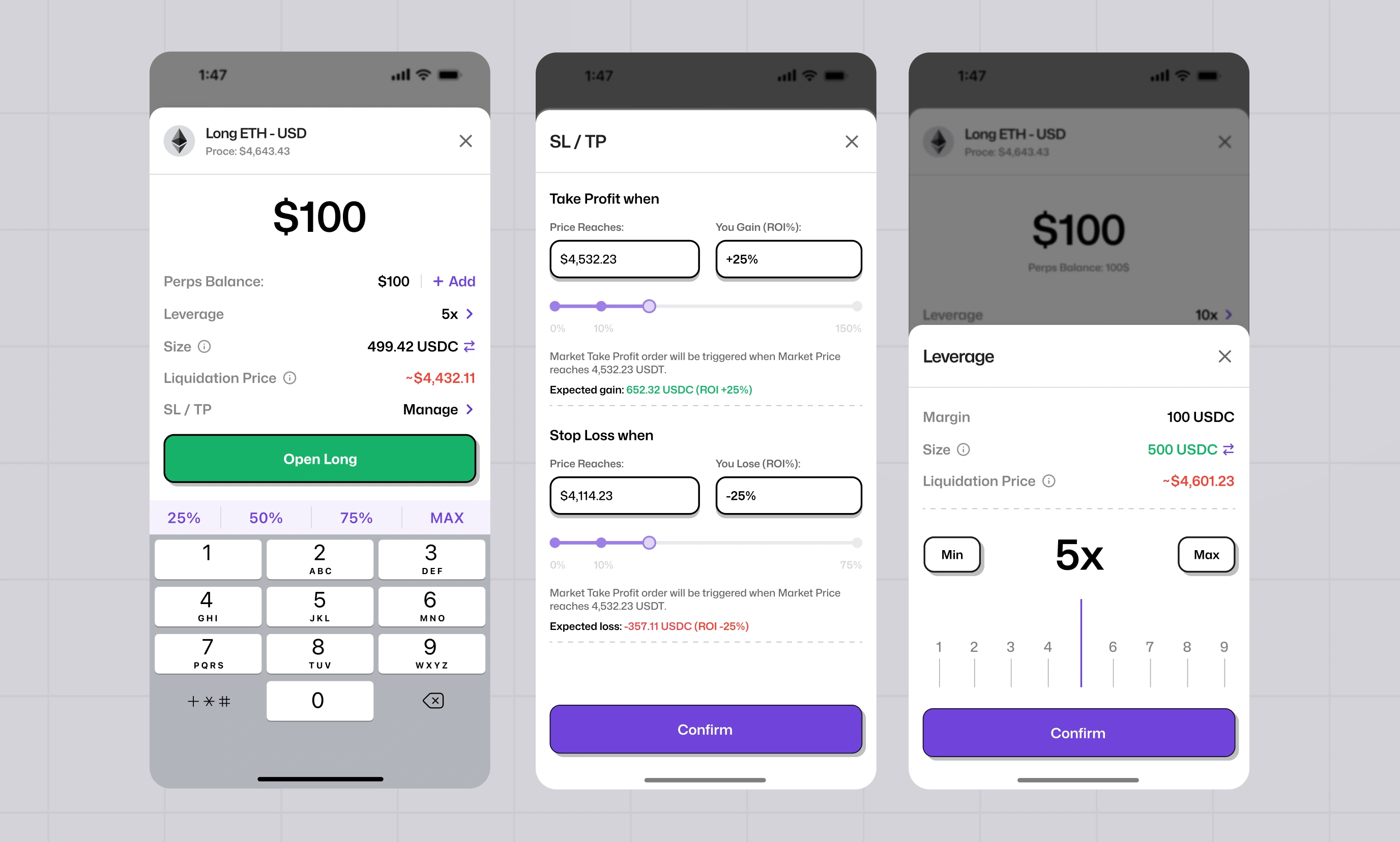
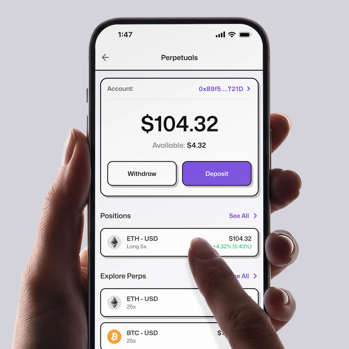
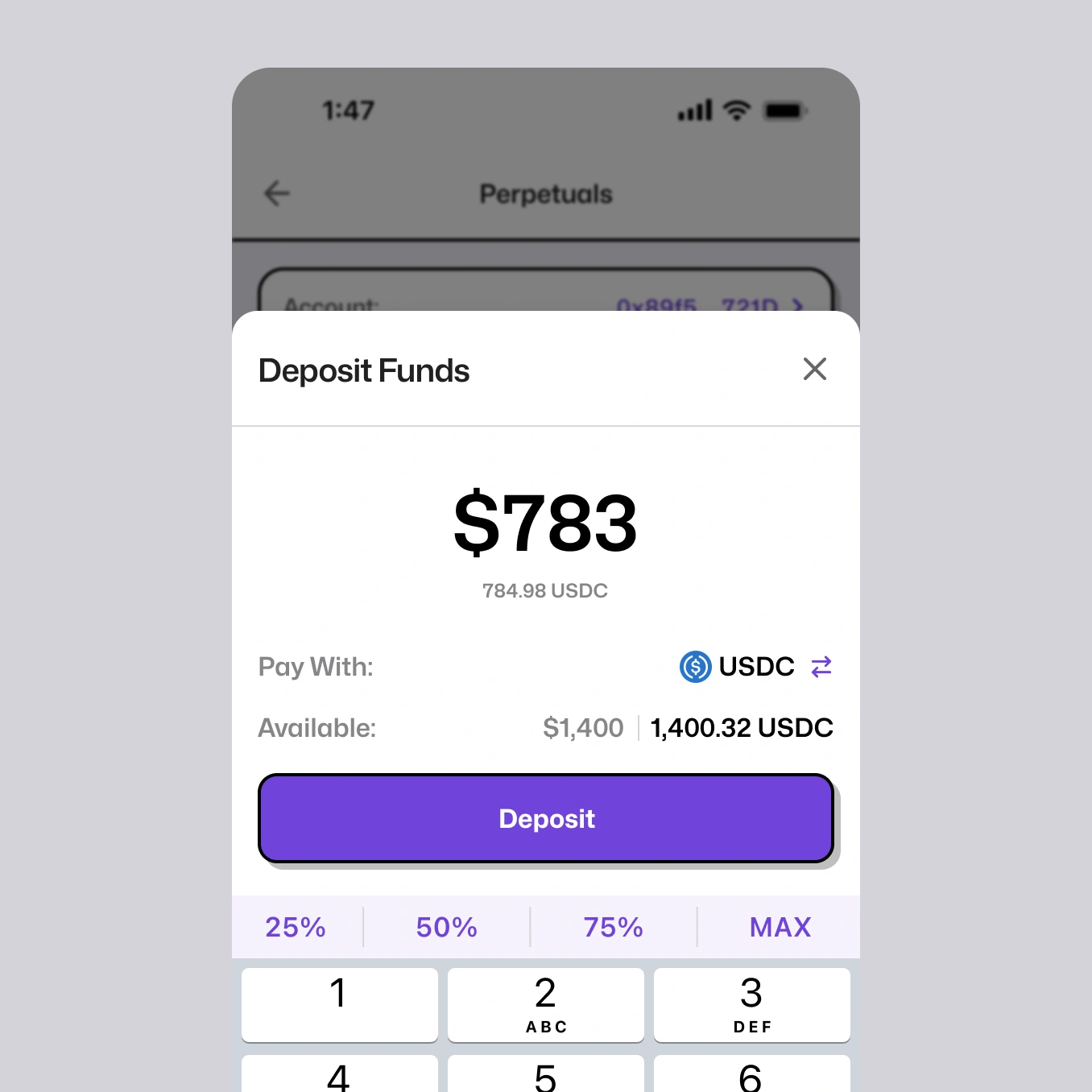
Trading and holding are different mindsets, so we gave perps their own hub with its own balance.
A separate space inside the app: fund it deliberately, trade inside it, and your main wallet stays untouched. Someone who never opens it never has to see leverage at all.
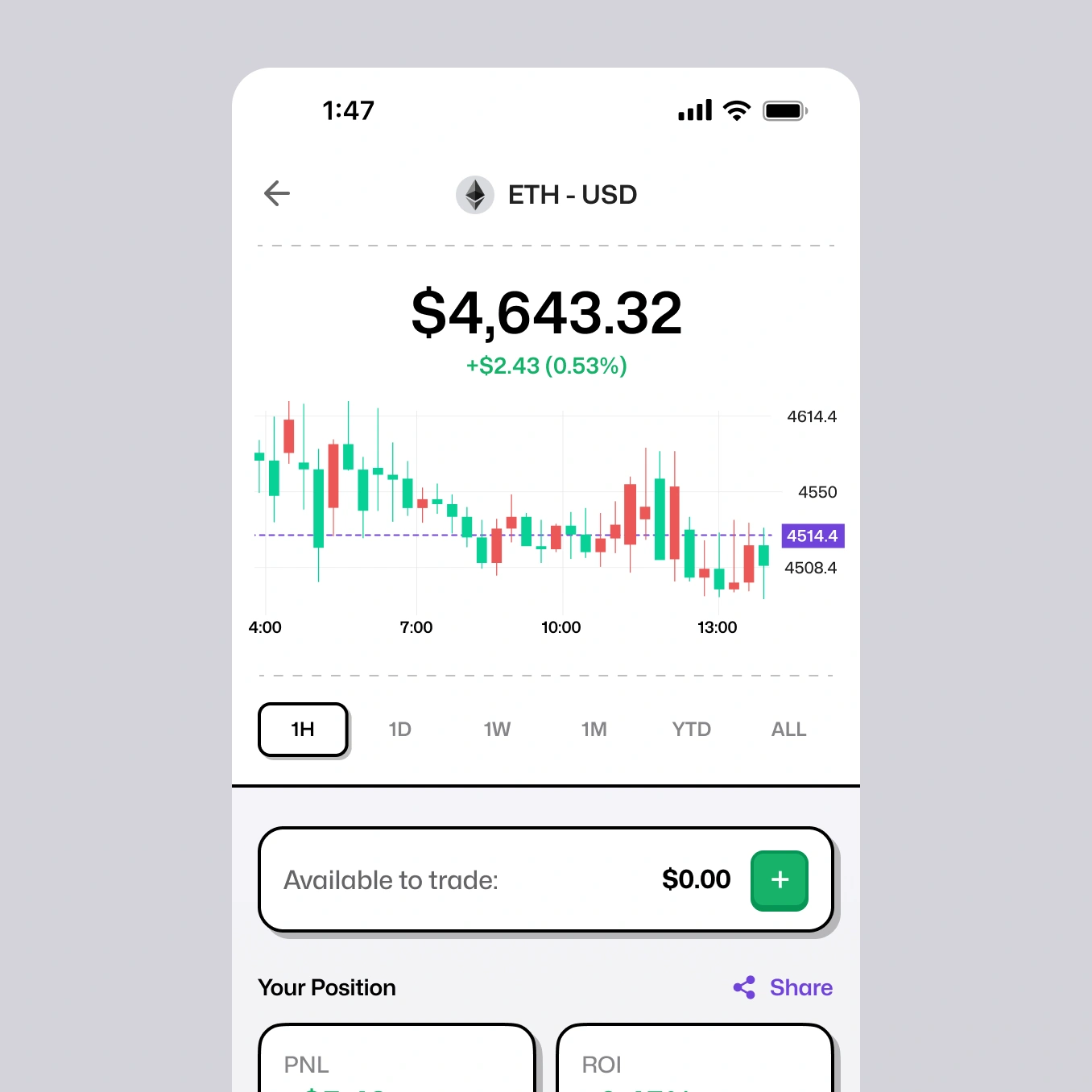
Inside the hub, the interface is built around what traders actually check first — position, PnL, and open interest up front, order entry within reach, up to 50× on 100+ pairs. Everything else stays out of the way until it's needed.
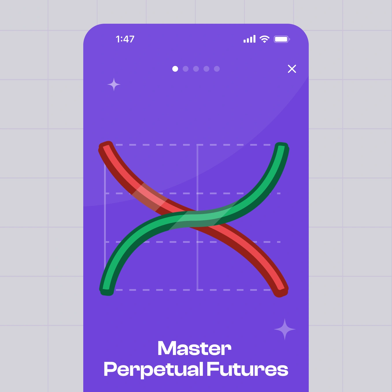
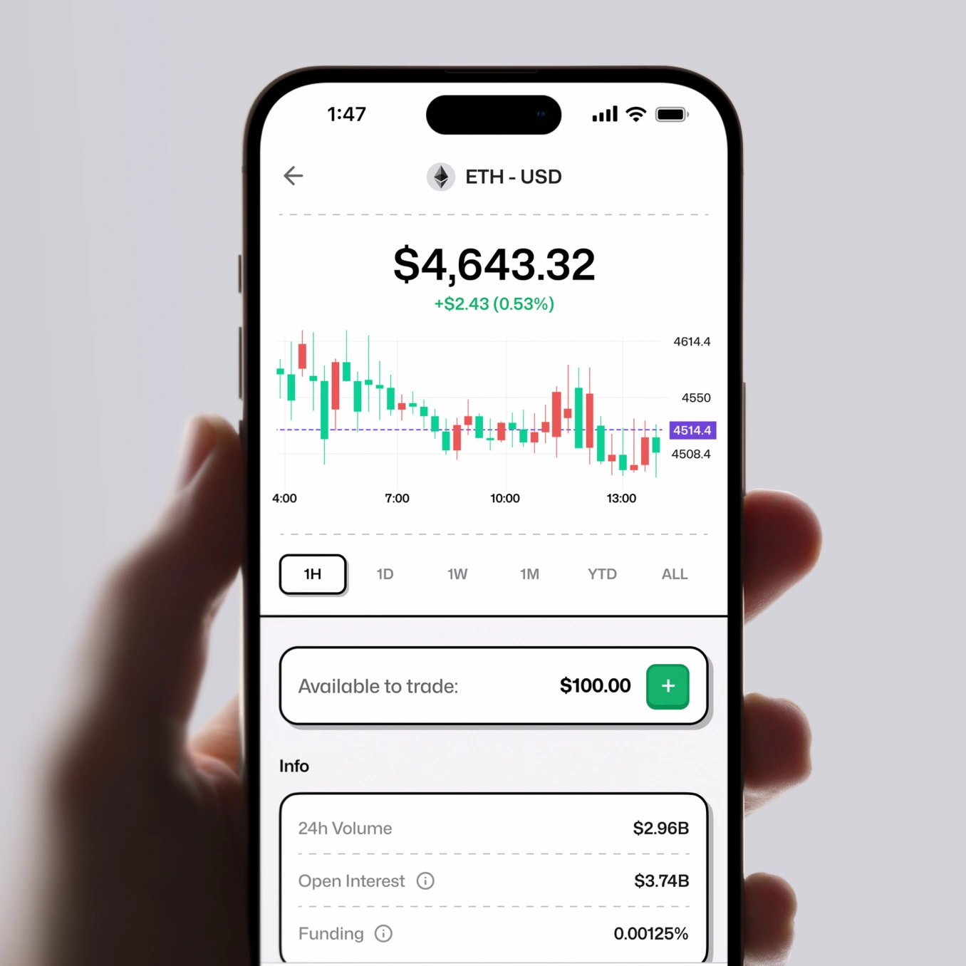
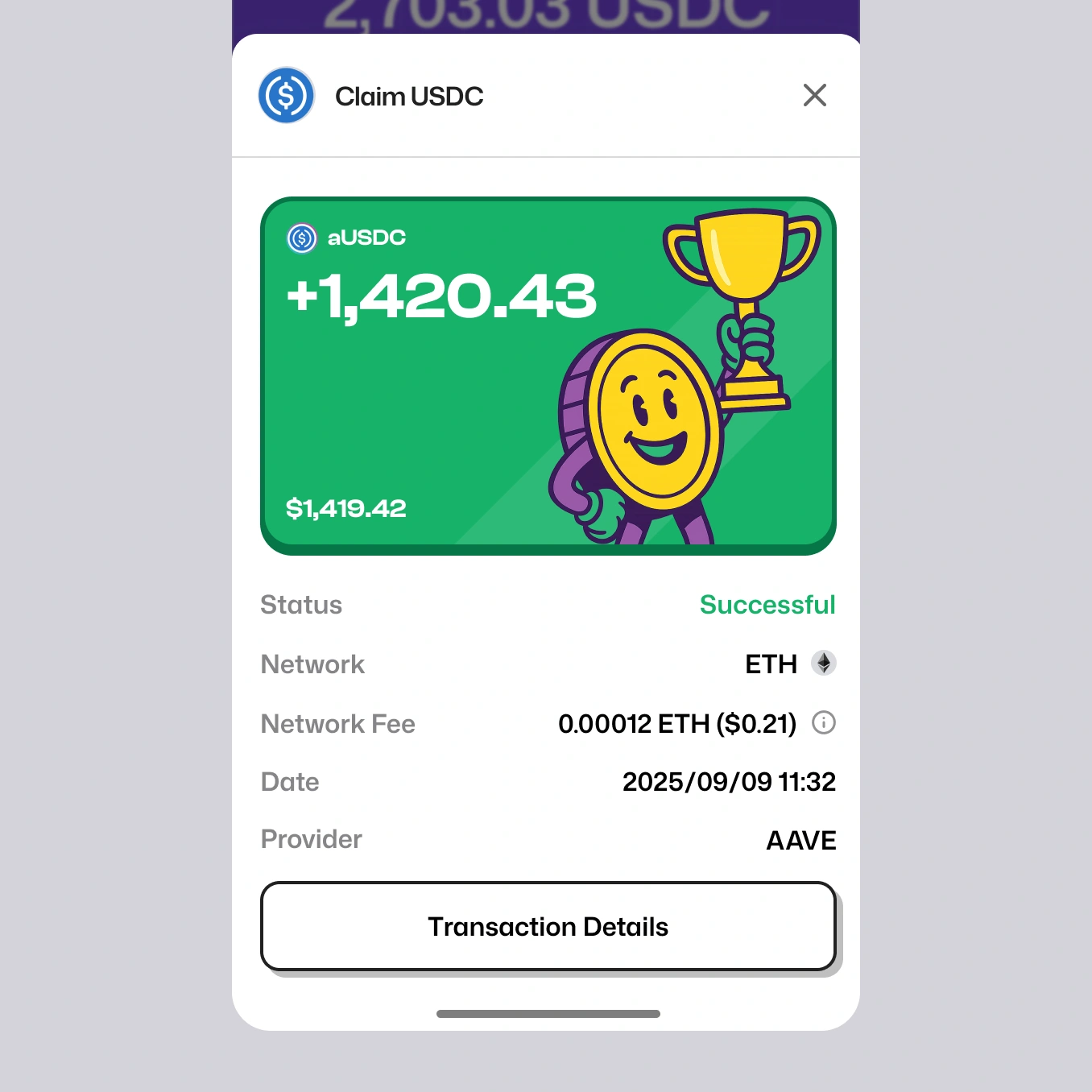
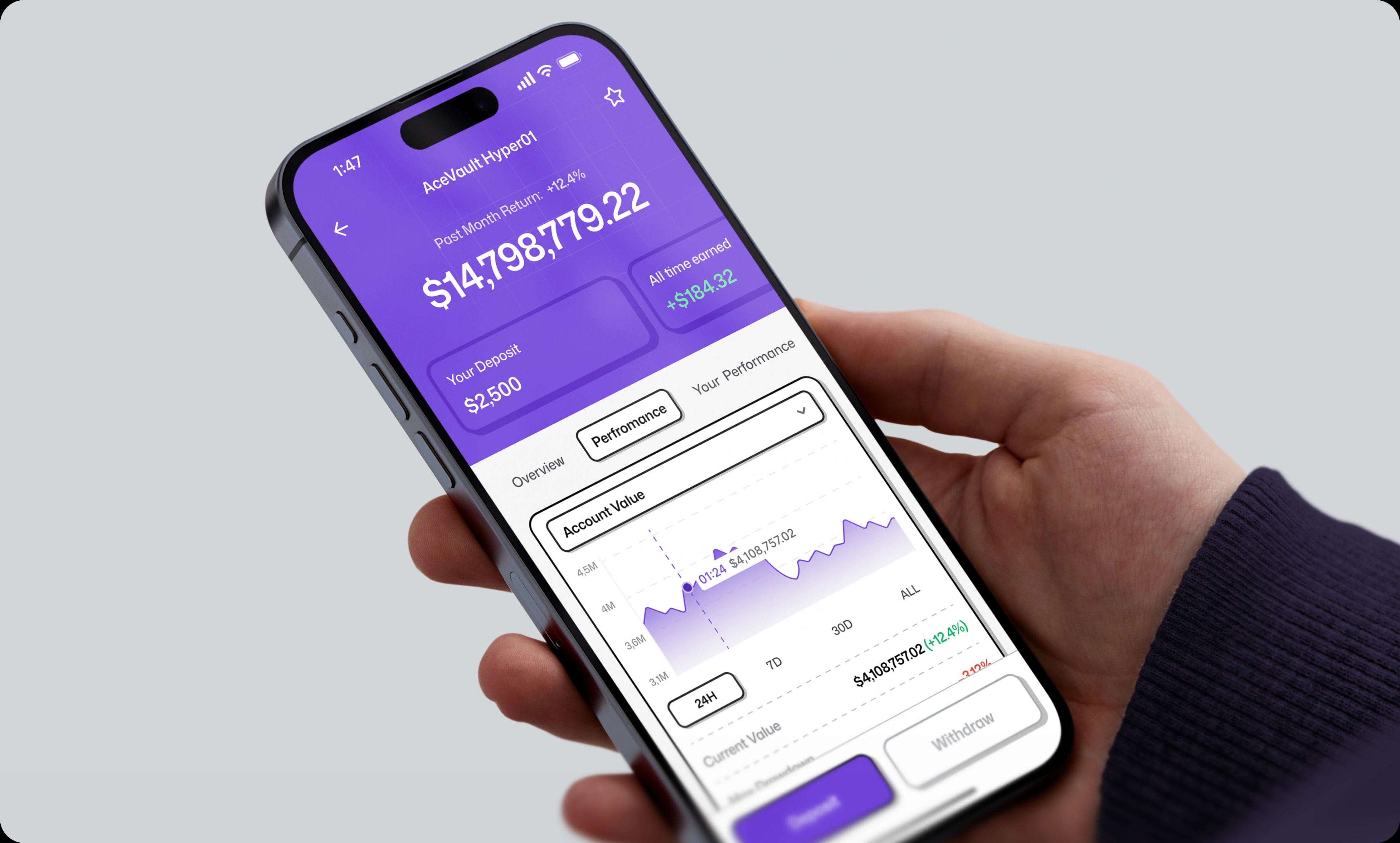
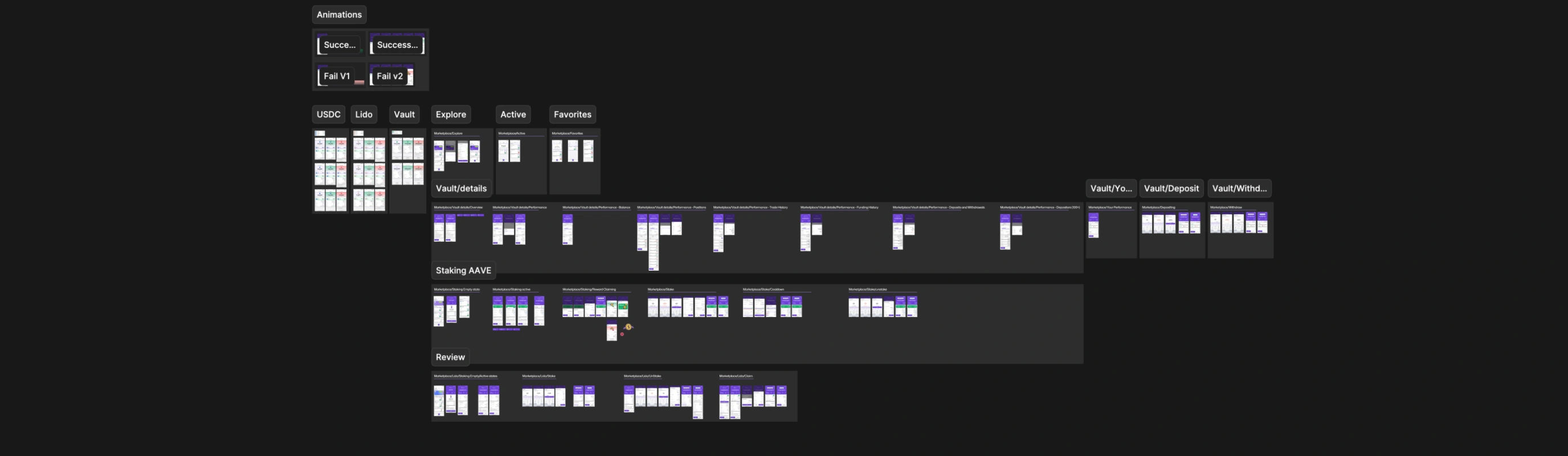
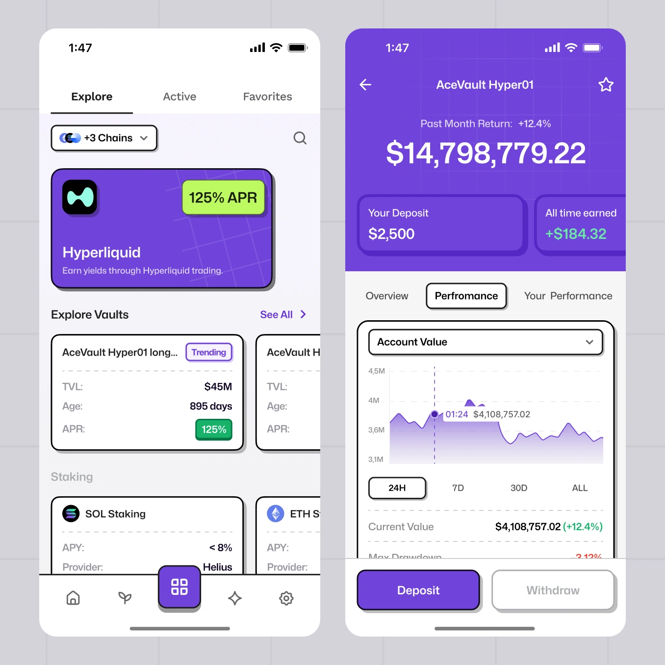
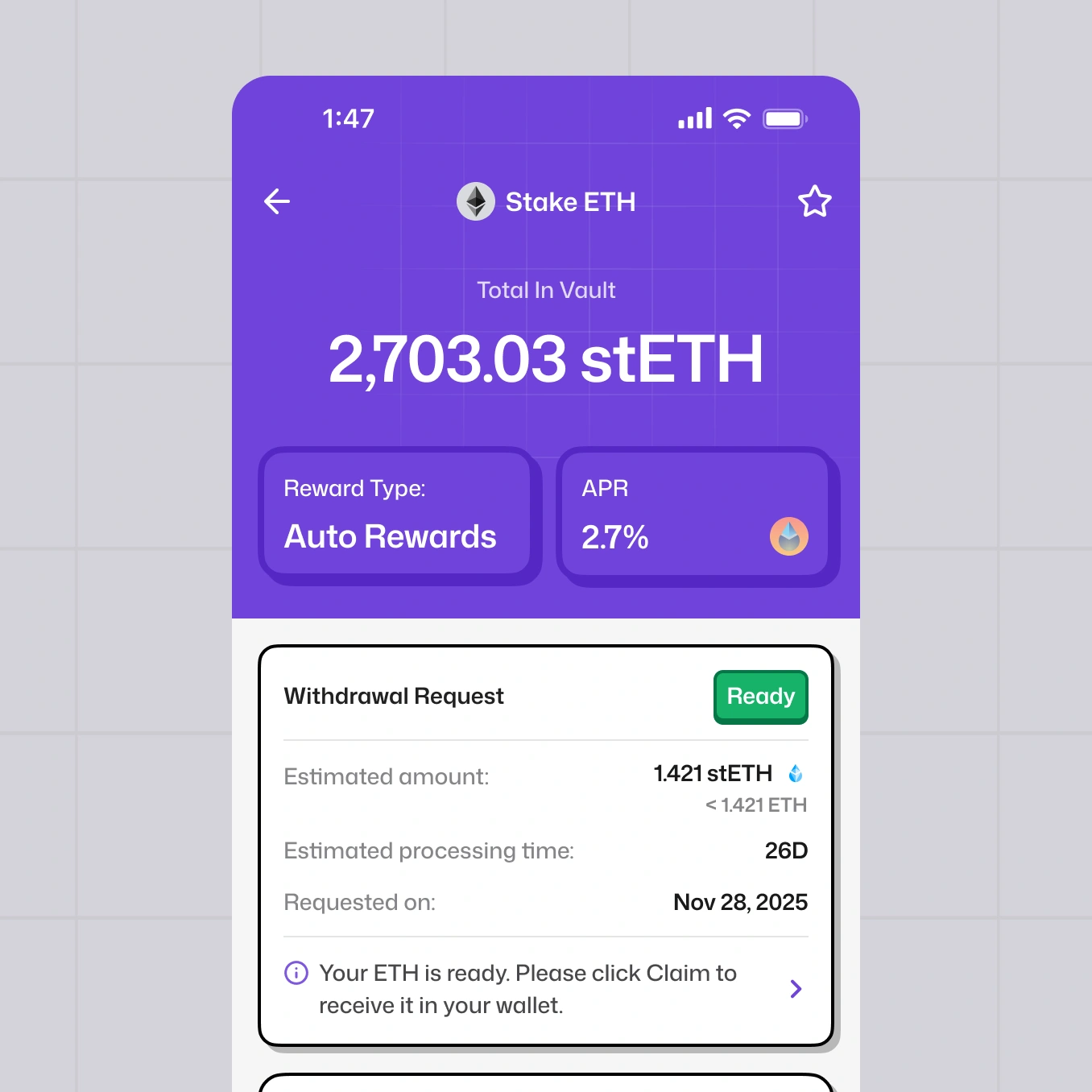
Vaults, staking, and yield strategies usually live across a dozen dApps, and picking one means opening tabs, comparing numbers, and trusting your own homework. We built the marketplace to work the way people already browse apps: Explore for finding something new, Active for what your money is already in, Favorites for what you're watching.
Filtering does the work that research used to. Chain, timeframe, and yield narrow a hundred networks down to the few that apply to you — so the list on screen is always one you could act on.
Each vault card carries everything the decision needs in one view: APR, TVL, age, provider, and safety signals — the numbers people would otherwise hunt for across three sites, and the ones that tell you whether a 125% APR is worth trusting.
onboarding we designed
this in mind?
