Brand, website, and dApp for a DeFi 3.0 protocol trusted by 40,000+ holders
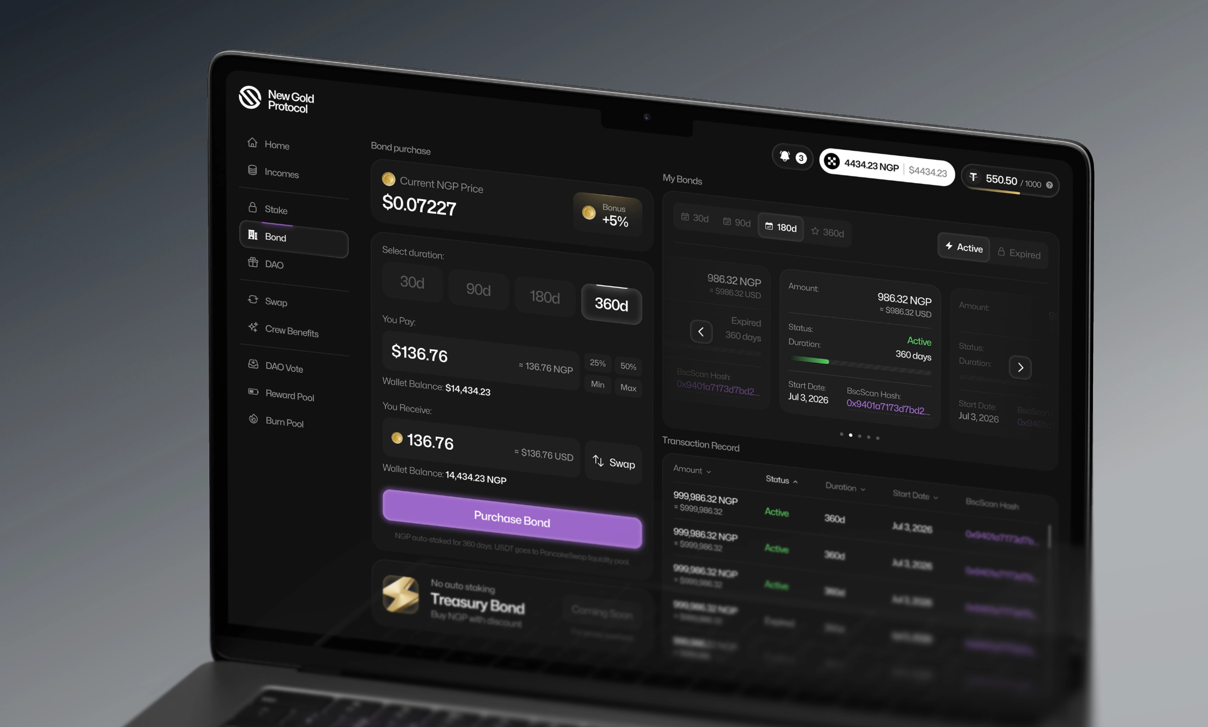
NGP is a DeFi 3.0 protocol built around sustainable tokenomics: protocol-owned liquidity, deflationary supply, and on-chain governance. Ambitious mechanics — and almost impossible to explain to someone landing on the site for the first time
We were brought in to make the complex feel simple: a brand that signals credibility in a market full of noise, a website that explains the protocol in seconds, and a dApp where staking feels safe rather than intimidating.
DeFi has a trust problem, and NGP had an extra layer of it: an anonymous founding team. That meant the design couldn't lean on founder photos, team pages, or personal reputation. Every pixel of the product had to do the trust-building instead.
- Client:New Gold Protocol
- Services:Brand identity, dApp Product design, Website design
- Timeline:3 Months
- Chain:BNB Chain
Complex mechanics, three-second attention span. Deflationary burns, cooling-off periods, protocol-owned liquidity — real mechanisms that justify the protocol, but lose a first-time visitor instantly if explained the way whitepapers explain them.
One system, three surfaces. Brand, marketing site, and dApp had to feel like one product. A visitor moving from the landing page into the staking flow should never feel like they crossed into different software.
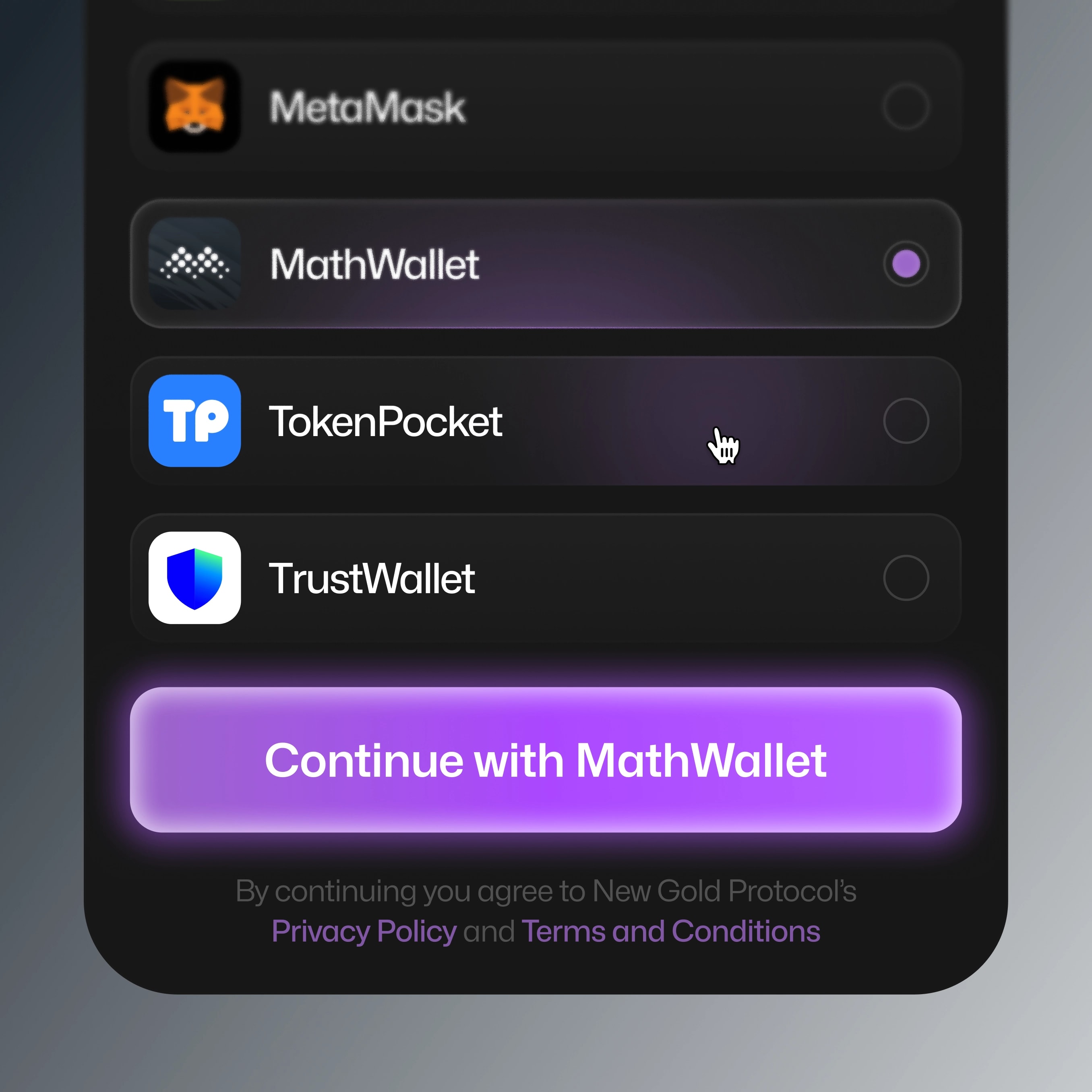
Web3 patterns, Web2 clarity. Wallet connection, approvals, transaction states — the moments where DeFi users get scared and leave. Every one of them had to be explicit, predictable, and reversible-feeling.
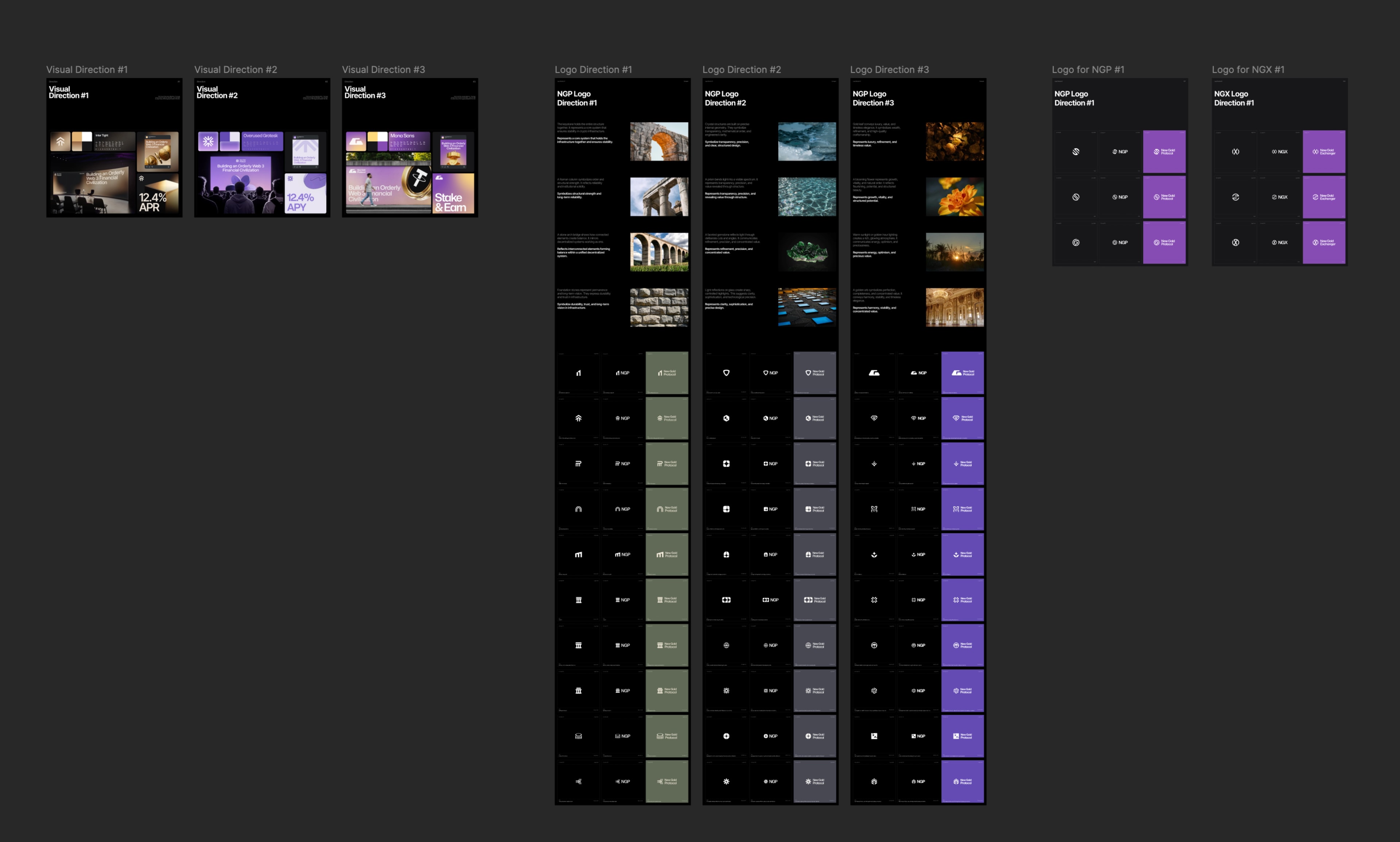
We started from the tension in the name itself: gold as the oldest symbol of stored value, "new" as the promise of on-chain transparency.
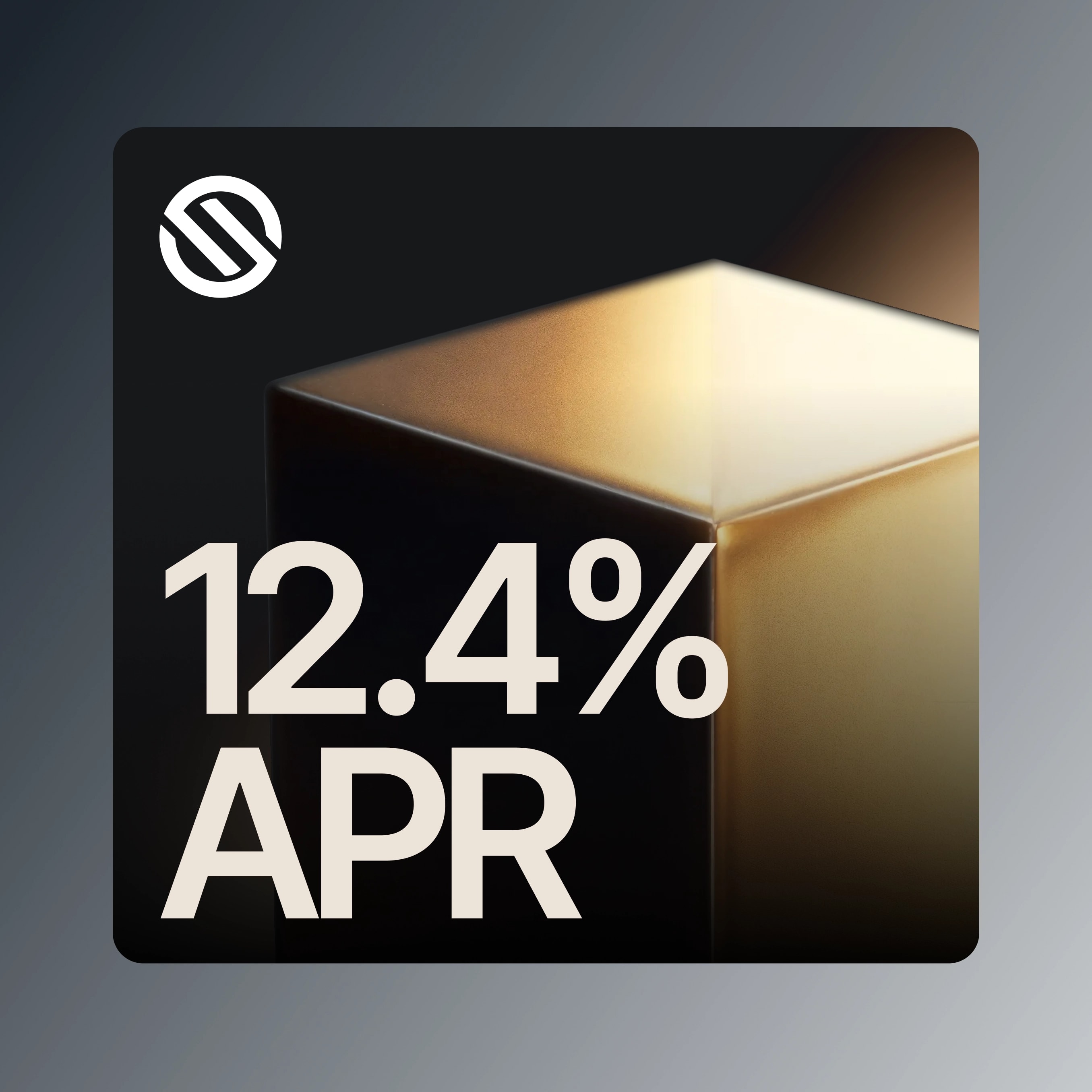
The identity system balances the two — color and effects, so the brand reads as an institution, not a token launch.
The system was built to stretch: website, dApp, social, documentation, and the NGX terminal all run on the same visual foundation, so the ecosystem grows without fragmenting.
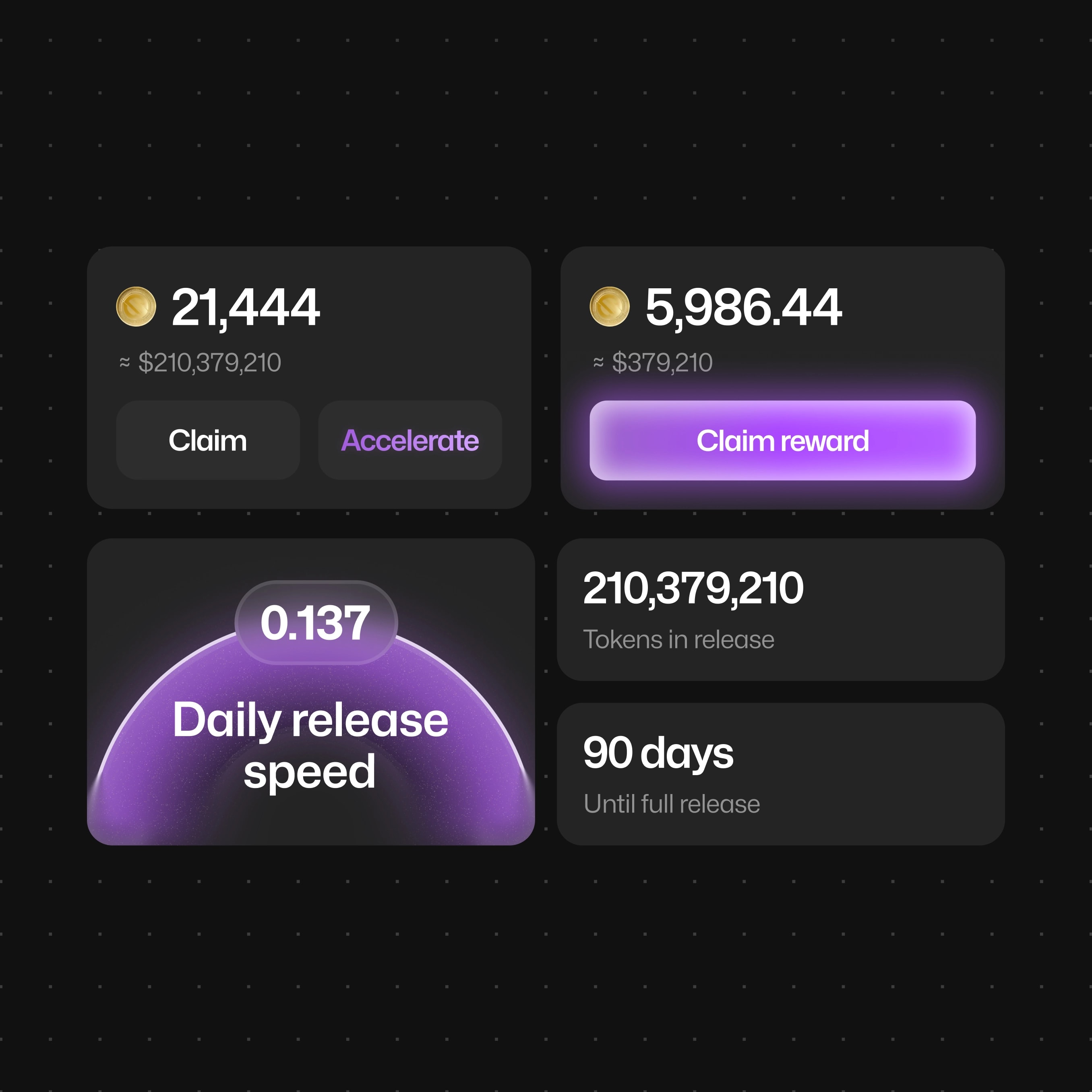
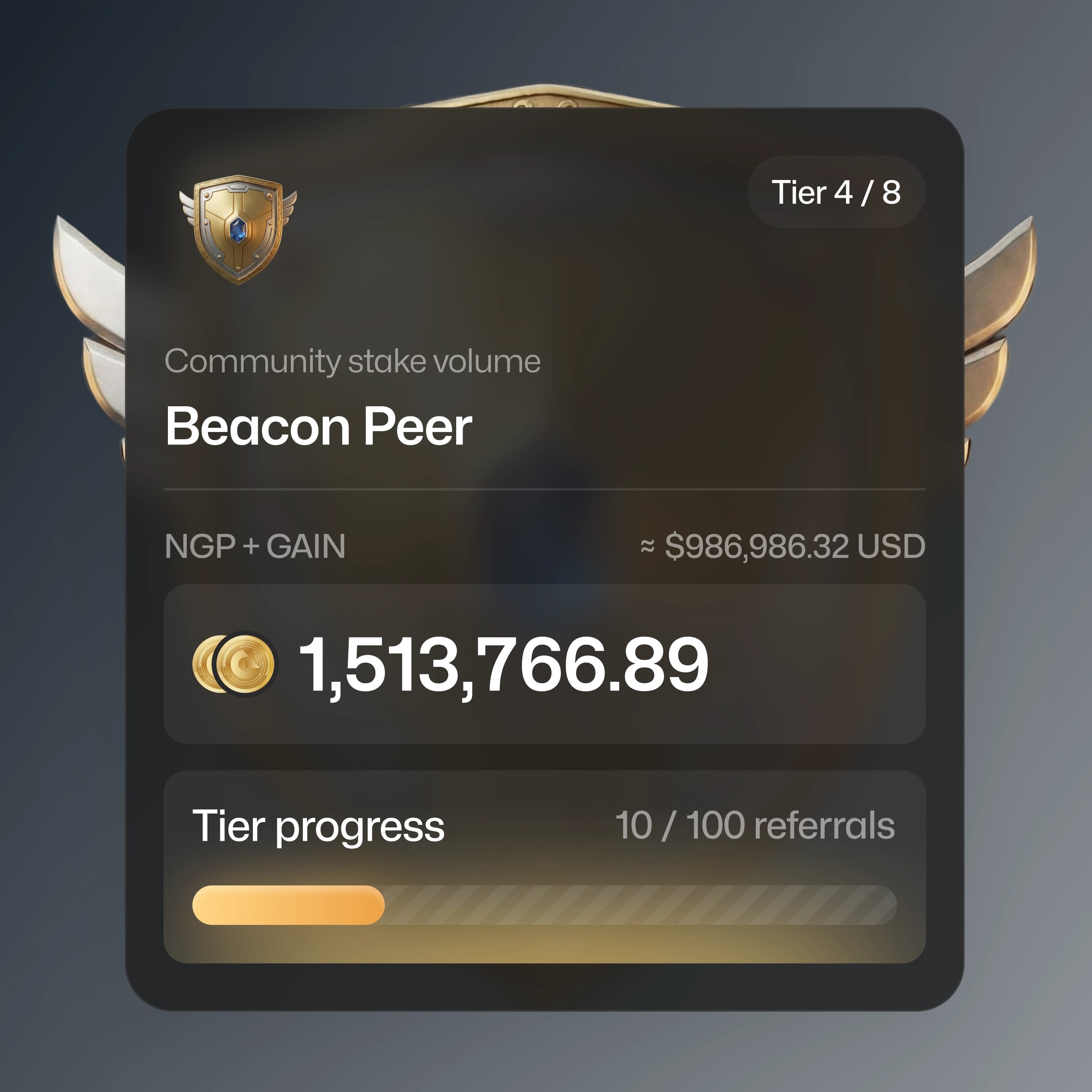
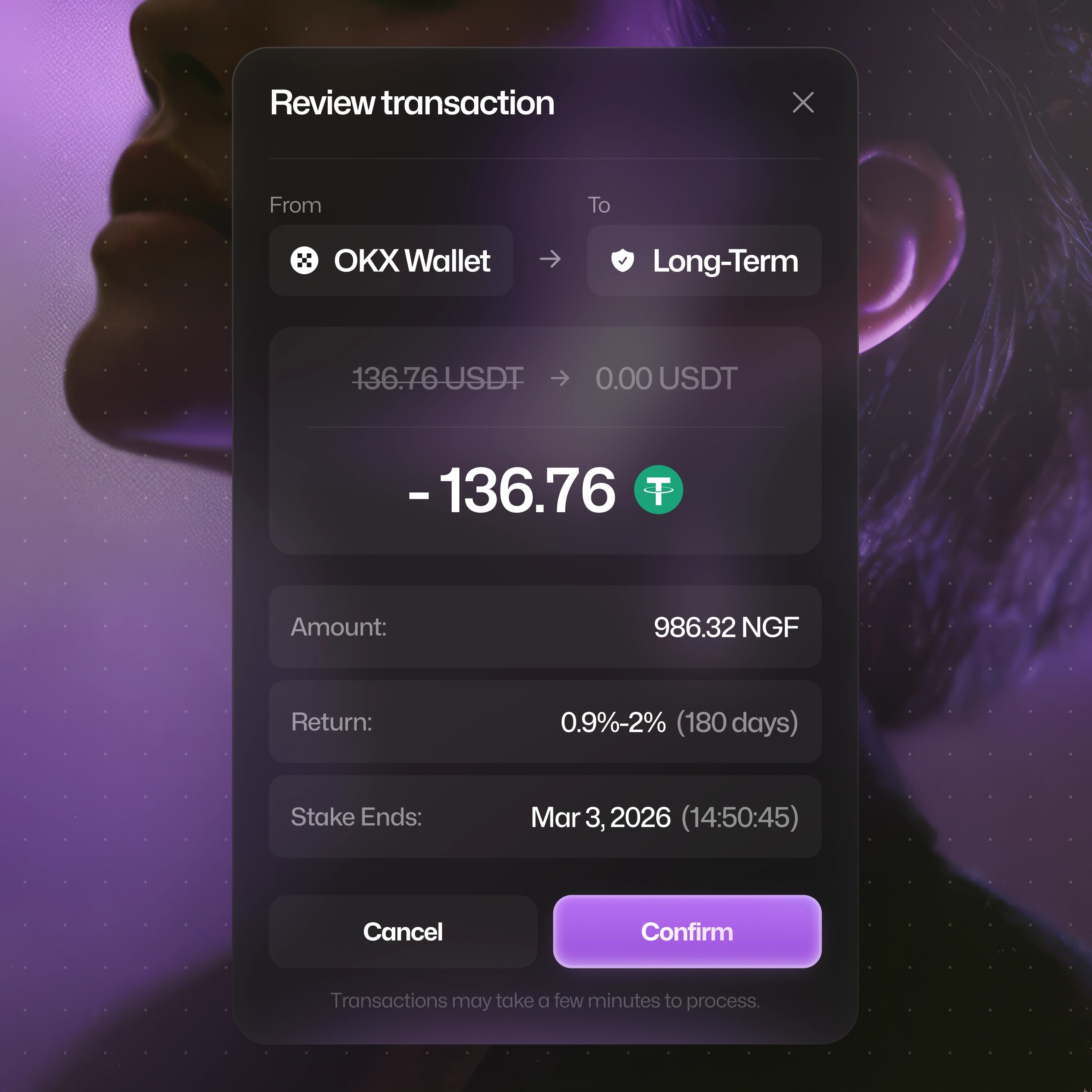
Every transaction moment answers three questions before the user asks them: what exactly is about to happen, what will it cost, and what happens next. Clear pre-transaction summaries, explicit approval states, no dark patterns around limits or fees.
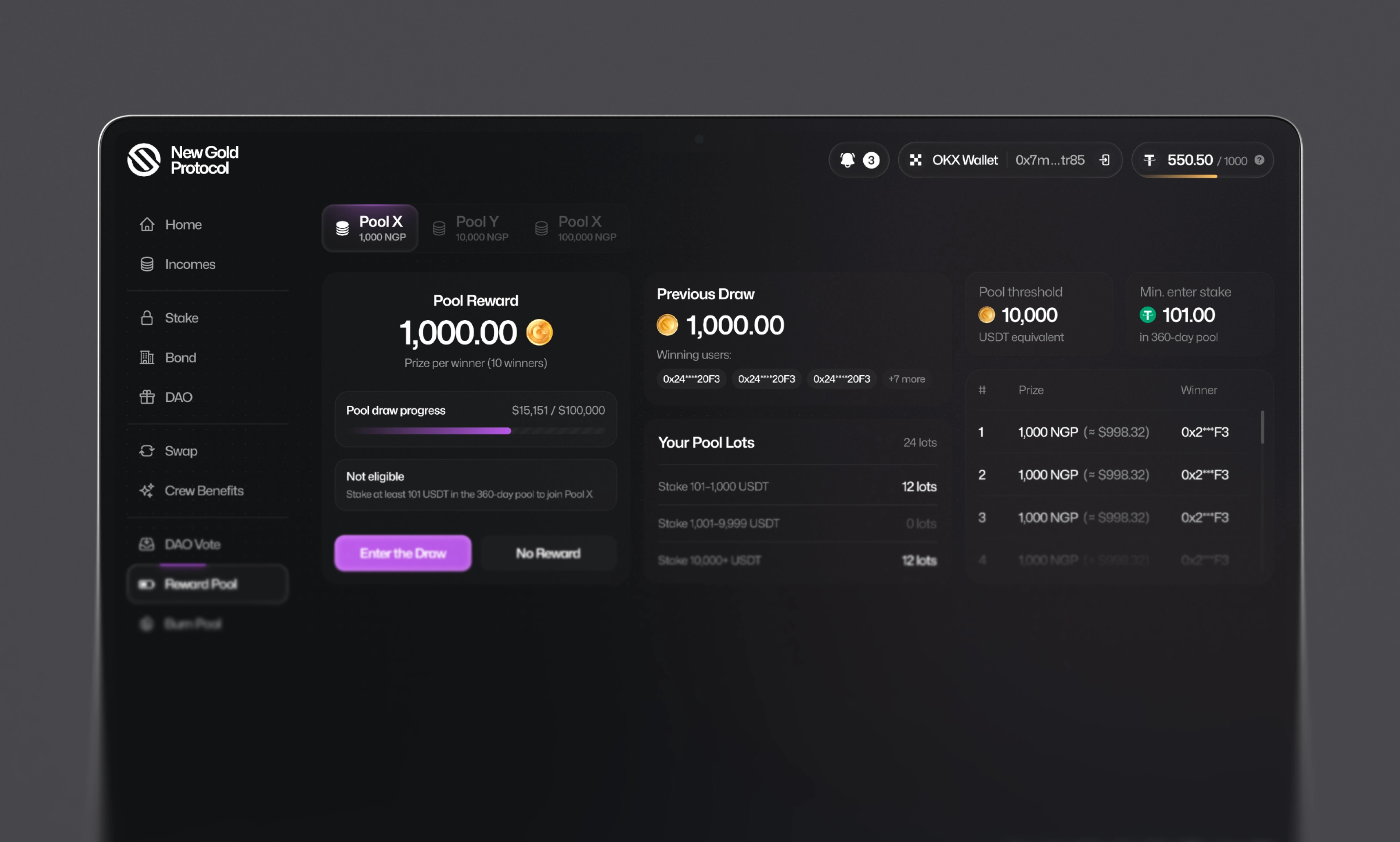
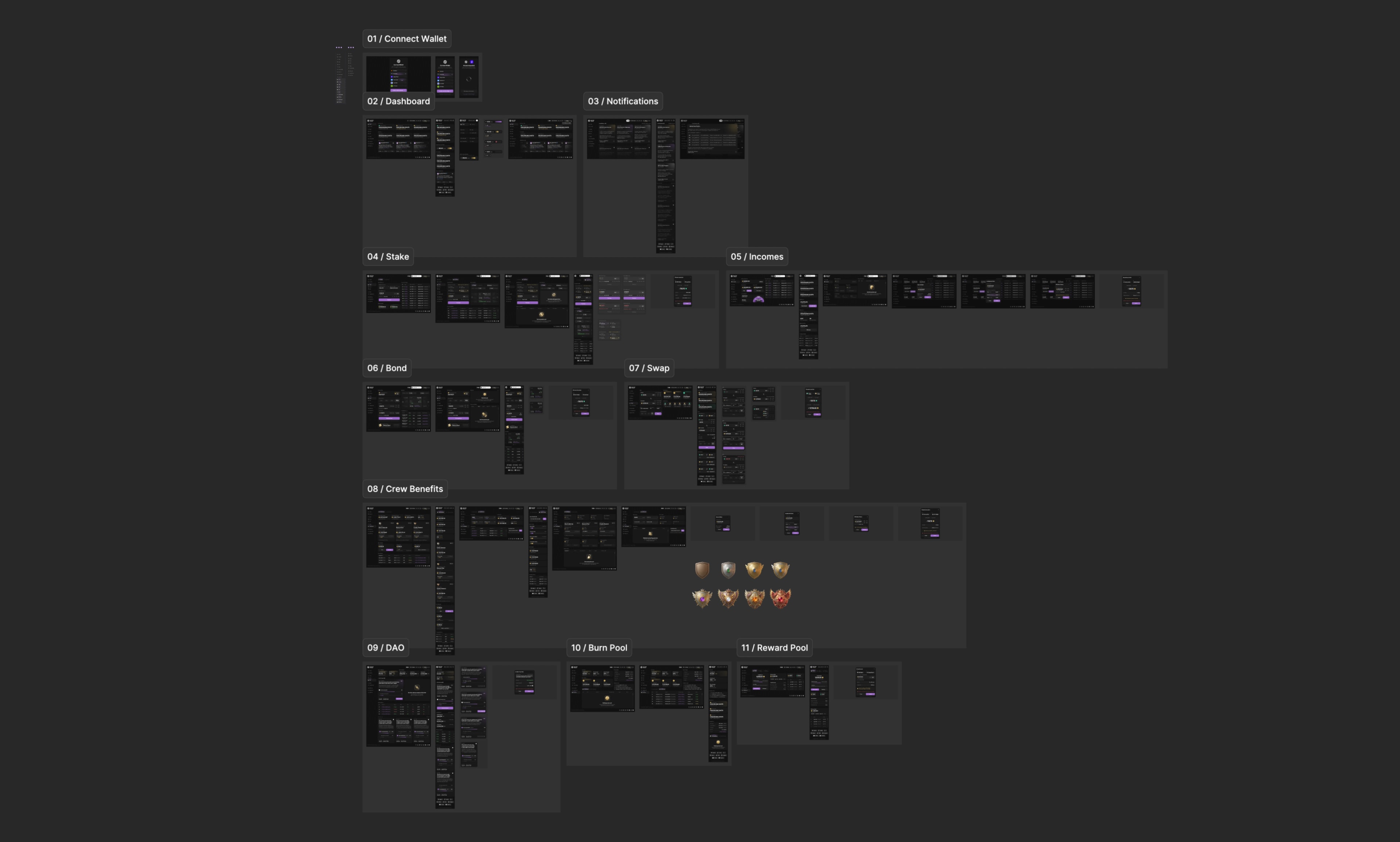
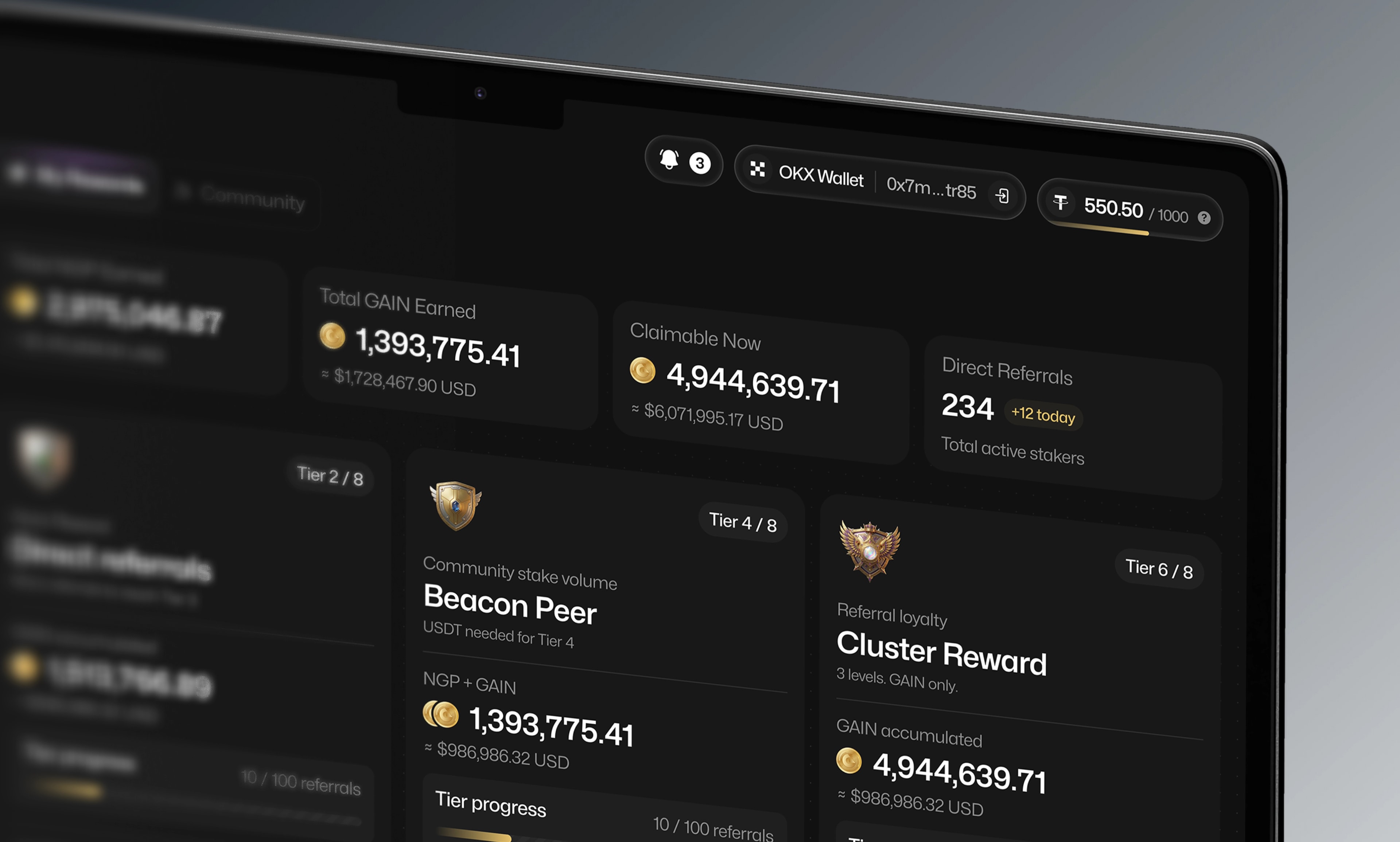
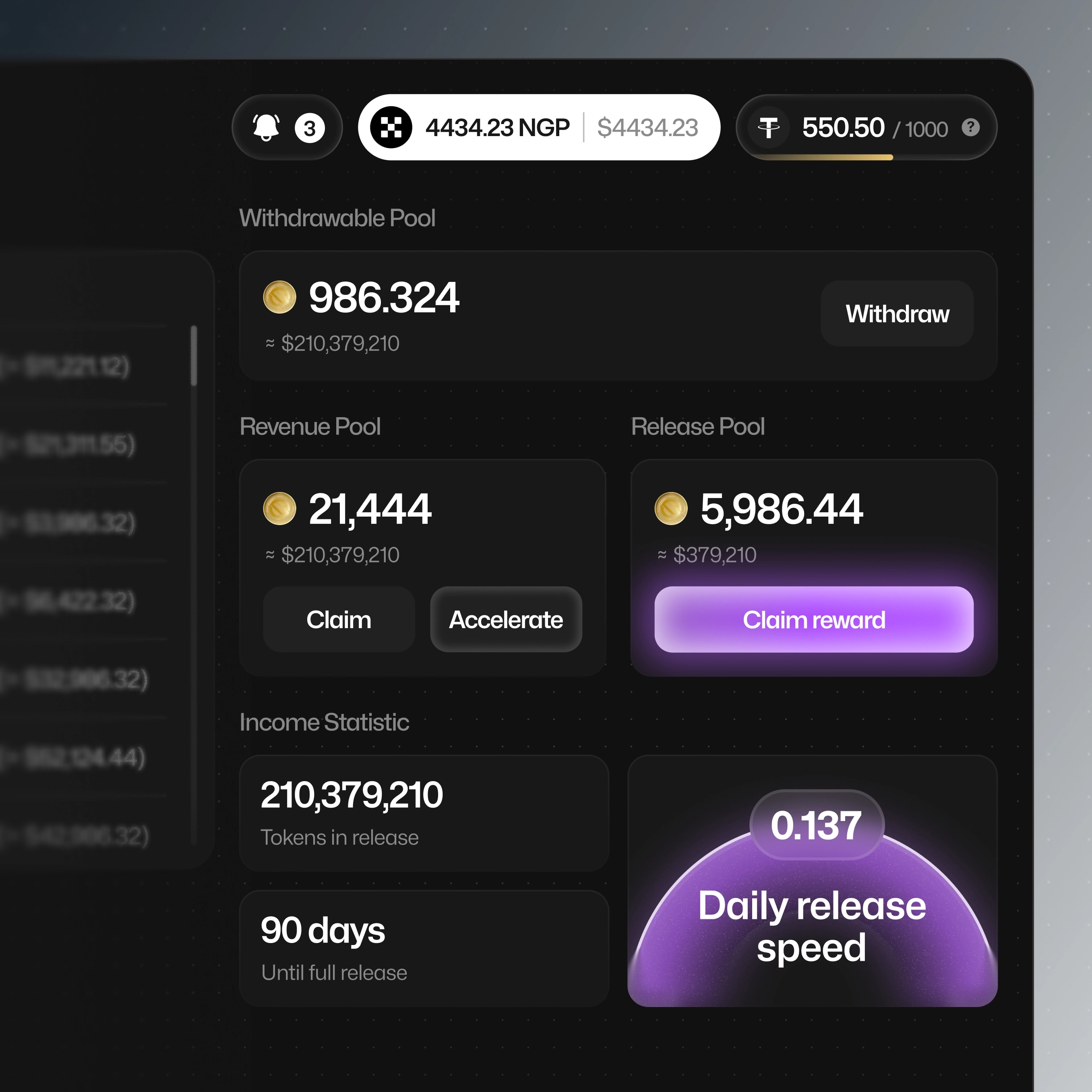
100+ screens across the full journey: wallet connection, staking, claiming, swapping to USDT, and referral flows — each designed against the principle from ambiguity to certainty.
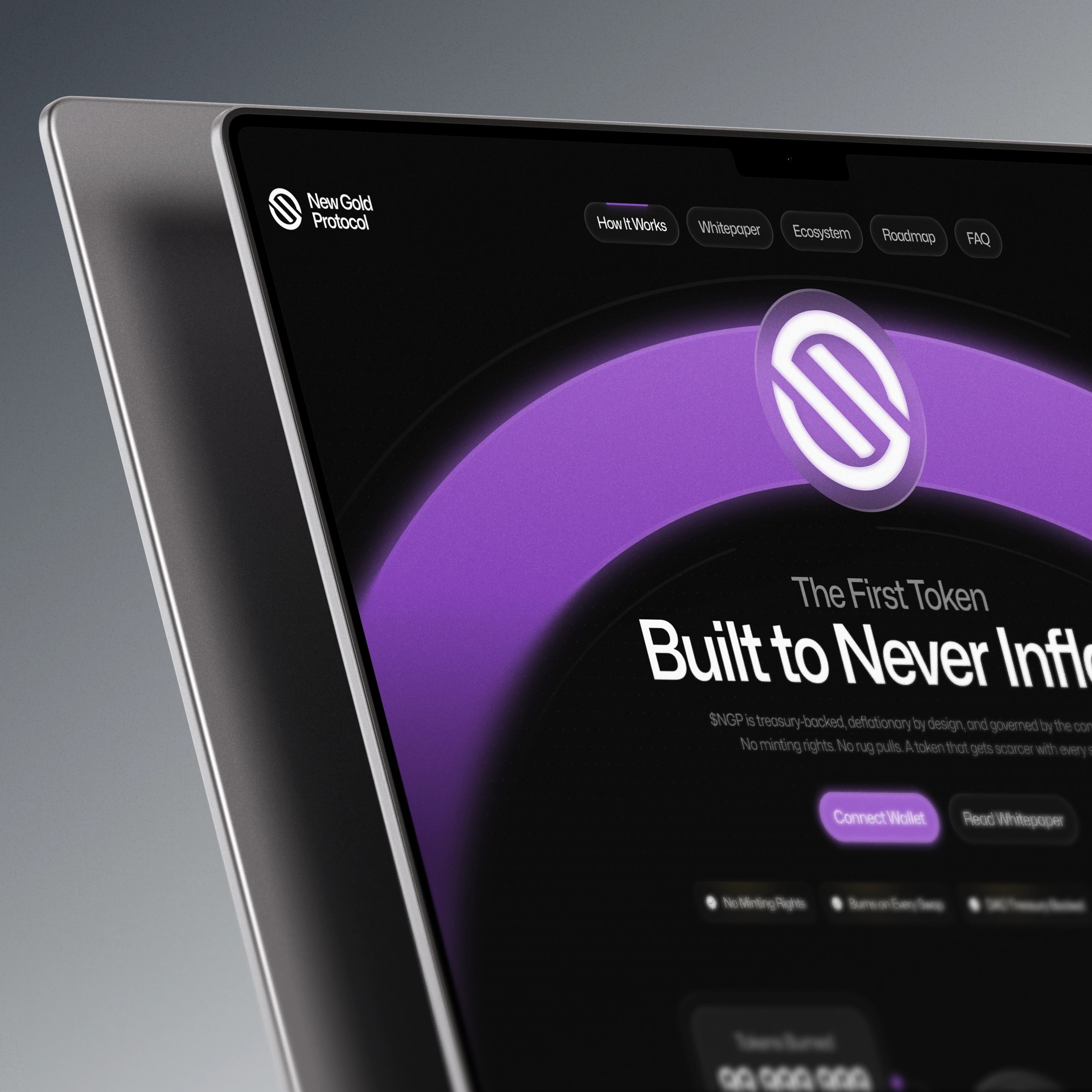
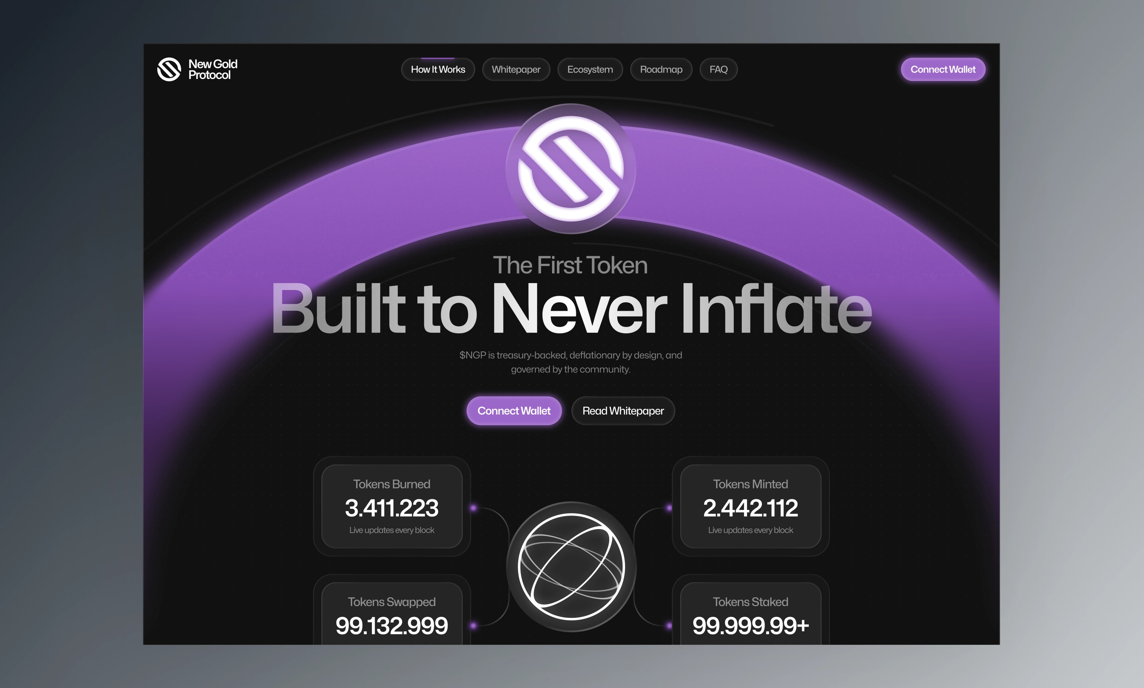
Mechanics compressed into steps. The tokenomics that take a whitepaper chapter to explain became a short visual sequence a first-time visitor can follow without a finance background.
Proof, front and center. Open-source contracts, renounced ownership, audit — the real trust signals an anonymous team can show. We sequenced them deliberately instead of burying them in a footer.
One path per audience. Newcomers get the "what and why." Degens get straight to the numbers and the dApp. Neither crowds the other.
this in mind?
